don’t judge a tune by it’s cover, but…
The psychedelic period of the late 60’s & 70’s is arguably the most visually rich when it comes to album artwork- in my collection anyway. Roger Dean, Rick Griffen, Lee Conklin for example. I’m sure much has been said and documented about that period so I won’t be going deep into it here – yet.
Instead I’m posting about a period of vinyl artwork that came out from the late 80’s early 90’s. Some of my early twelve inch records that I guess are best described as Balearic. Mainly from England and inspired by early headinists partying in Ibiza.
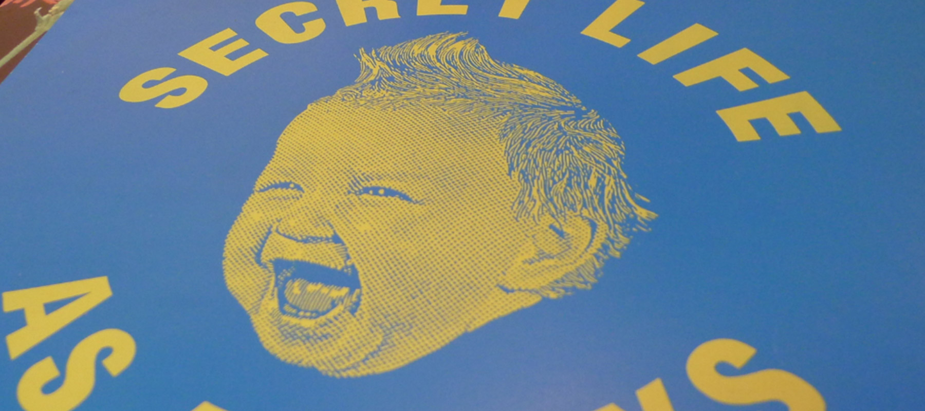
In a sea of white labels and un inspiring artwork these have always stood out to me. I noticed that a few of the cover designs from my collection were designed by the same artist. A Dave Little. Clever illustrations and stand out graphics.


After some digging, it seems David also designed fliers for clubs ‘Okay, dirty little raves….’ I used to frequent. He speaks about being influenced by the psychedelic scene (Rick Griffen artwork) with his 90’s twist for acid house and Balearic flyers – explained here.
I’m glad that I searched this out, as it seems David’s work was all around me. After viewing the second video I recognised a comical chicken logo which looked like a Koshini London top I bought from Camden Market back in the day; I occasionally use for odd jobs now, but it once graced the dance floors/ fields in my teens.


Acid House Music, Art, Fashion, this guy was all over the scene and I hadn’t realised.
The designs are certainly of an age, but they hold up well. I don’t think you had to ‘be there’ to appreciate this work. These new recent prints Dave’s produced are both artful & playful, able to connect with viewers whether the cultural references, musicians, symbols & period are understood or not.

Find our more regarding the prints here: http://www.davelittle.co.uk/
Melt,
Darren